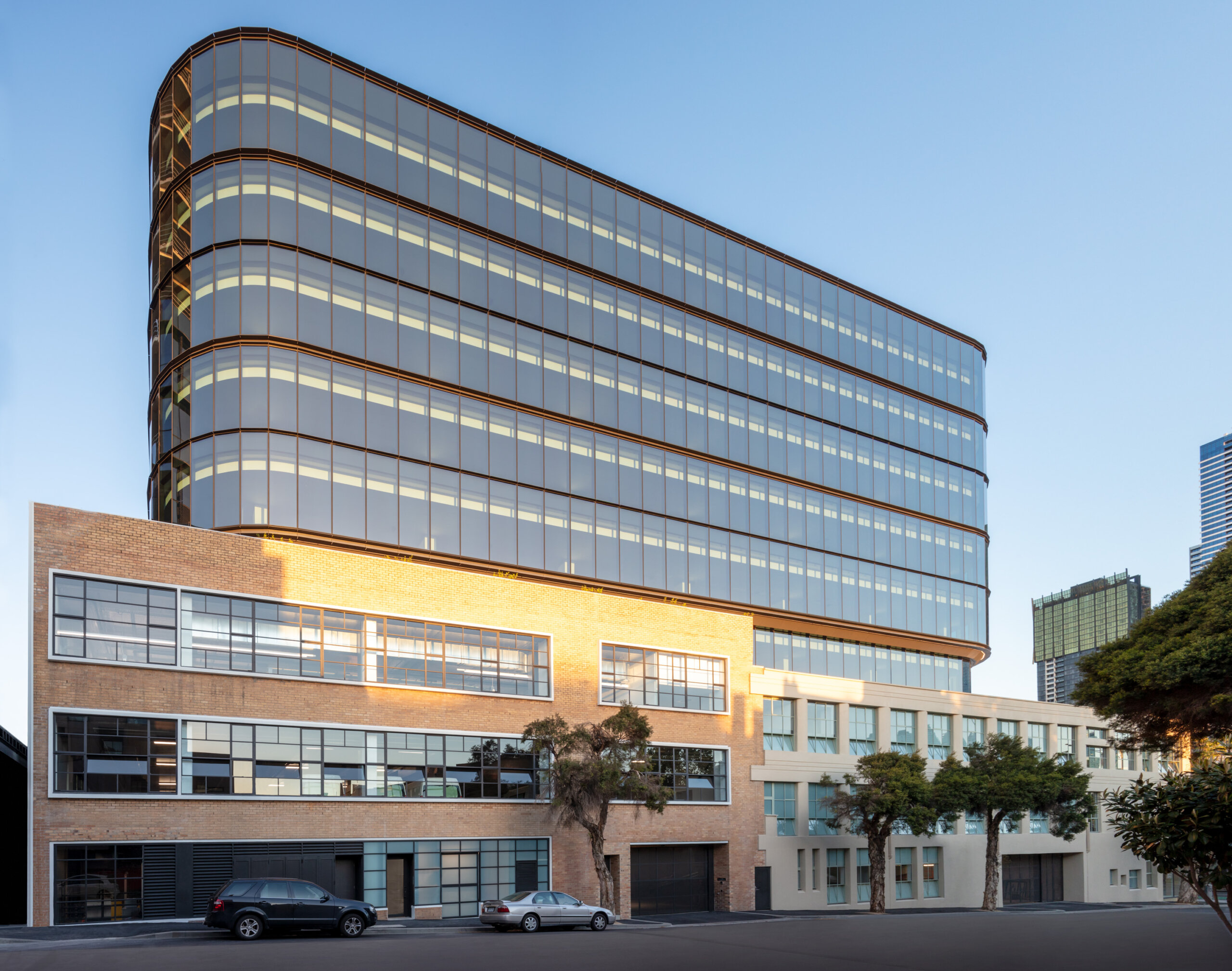
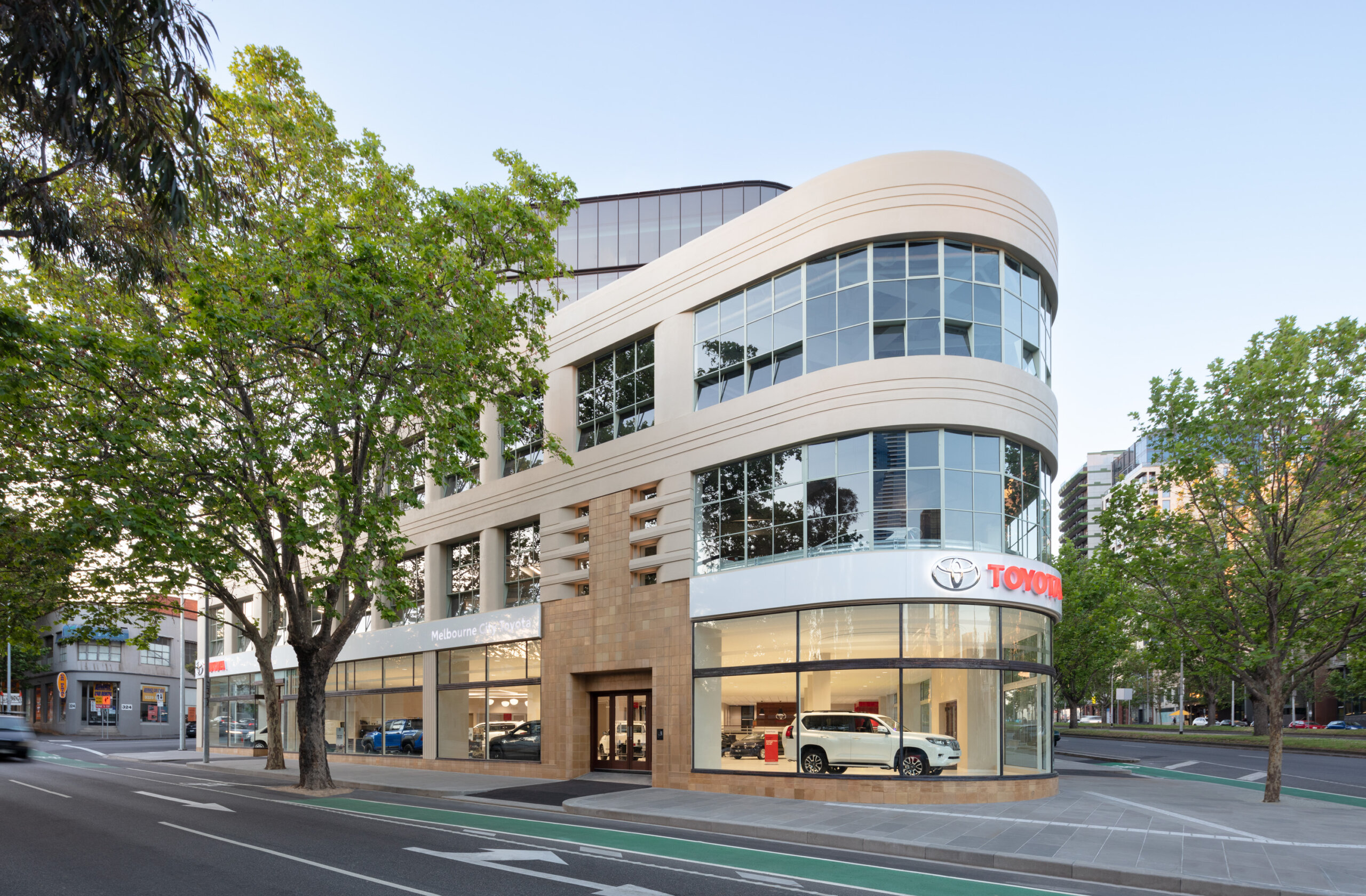
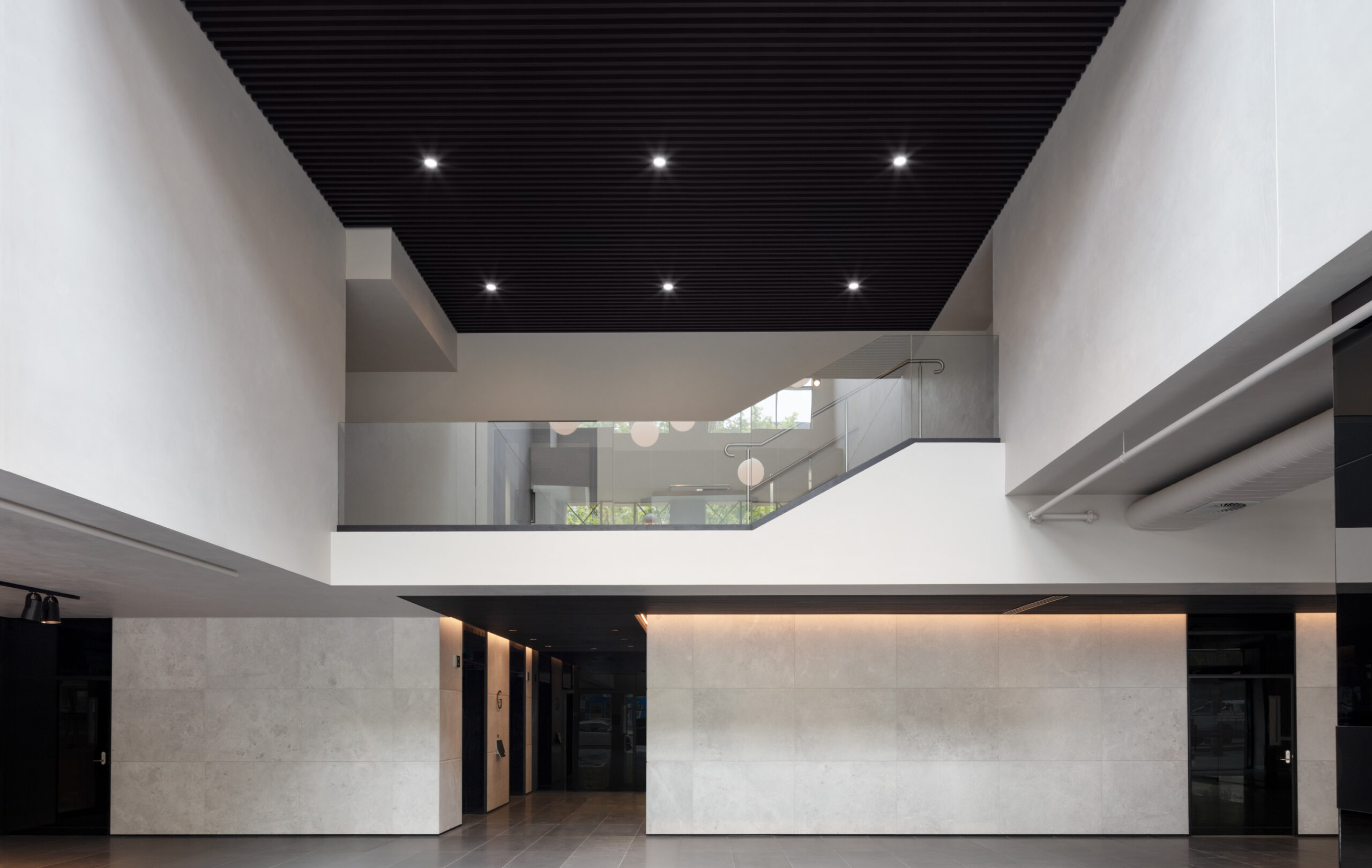
The curved corners of the office building construction soften the visual impact of this new form sitting above the existing heritage building, sympathetic to the corner of Elizabeth and Queensberry Streets below.
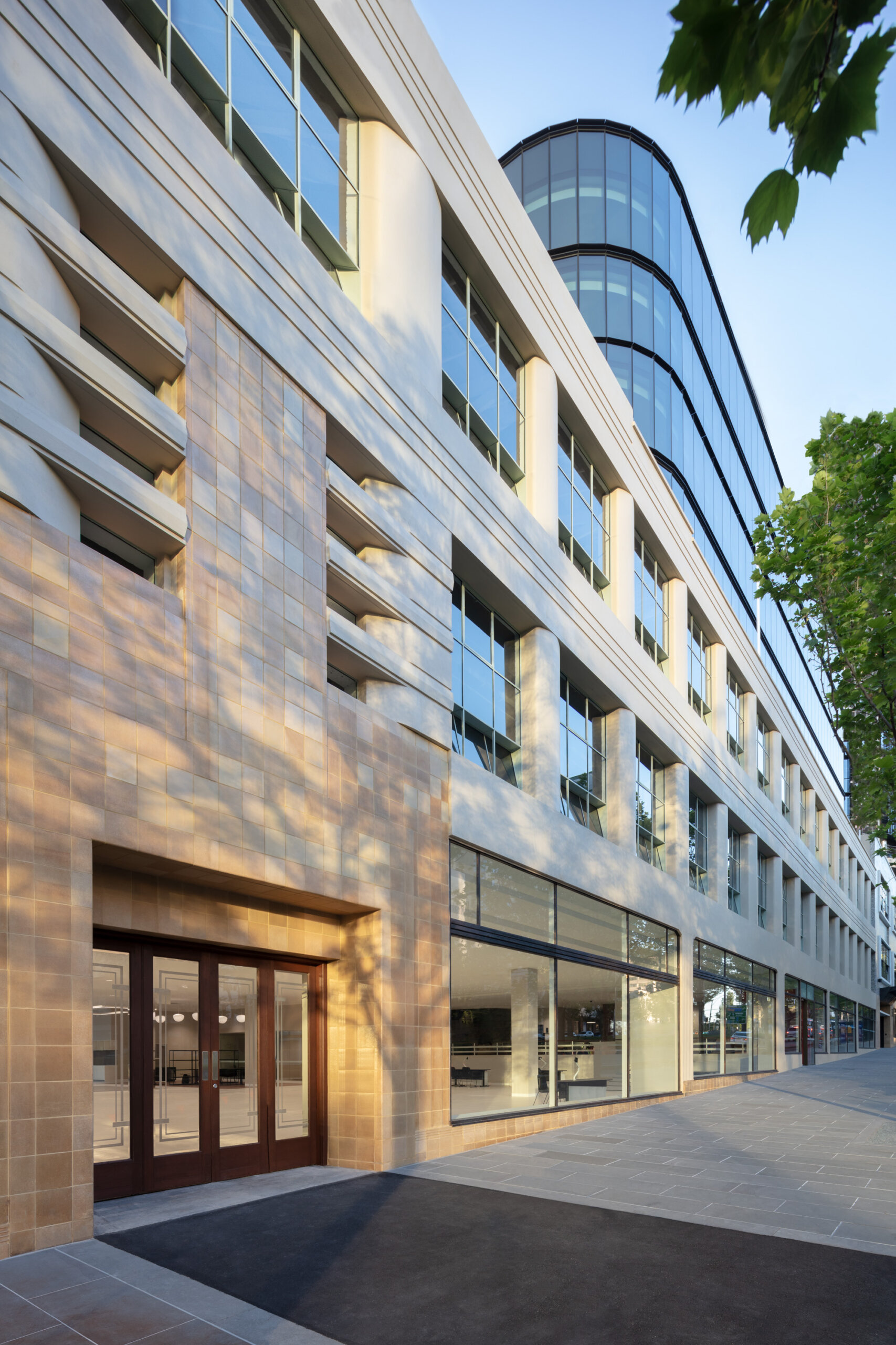
Due to the significant Heritage value of this building as an example of early 20th century showroom and workshop architecture, setbacks for the tower from the original façade have been carefully and sympathetically considered.
An appropriate podium is established by the existing façade and creates a visual separation to the new work.
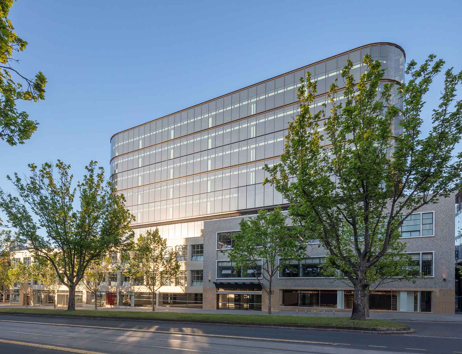
The intent of the tower is to present as recessive, with the existing heritage building remaining visually dominant.
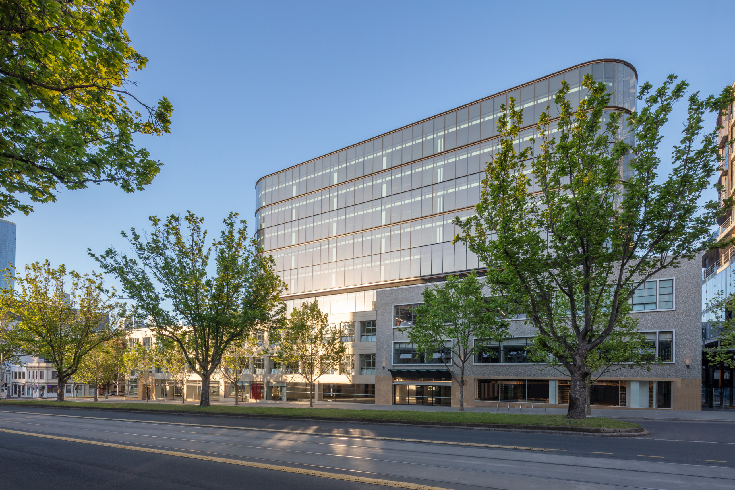
Muted tones are used throughout the tower, so as not to distract visually from the more dominant light tones of the heritage façade.
The curved corners of the office building construction soften the visual impact of this new form sitting above the existing heritage building, sympathetic to the corner of Elizabeth and Queensberry Streets below.
Rebated horizontal bands articulate the façade reducing the bulk and referencing horizontal form of the heritage building below.
